Building a great Email List is like digging a gold mine.
The more you work towards creating a refined email list, the more business you could generate from it.
An extensive email list of loyal subscribers is the greatest asset in today’s digital world.
- It will serve you as a good income source
- It will give you an audience with whom you can communicate on a personal level (Help’s you develop better service)
- It will give you a chance to hear out various customer experiences while ensuring their privacy (Help’s you incorporate new features to your products that could make a difference)
- It can help you in raising a good funding or expanding the business (Increased reputation)
- It’s your list of loyal audience and you have 100% access to it unlike Social media platform, where a small change in features could mean you losing the ability to communicate with your audience the way you want.
- It is Low cost 🙂 (Best for young business)
and much more…
Now that you know the benefits of having an email list, I will share you the secrets of creating one for yourself.
Caution: To make this happen, you need to be disciplined in your approach.
If you’re not building your email list, you are an Idiot! – Derek Halpern
[VIDEO] Check out this video to find out why!
Step 1: Have a content strategy
You need to have a Content strategy in place if you are planning to stay for the long run. You need to design an editorial calendar that will help you orchestrate and track your content progress. Don’t be overwhelmed. Your content strategy need not be perfect, you can always tweak it based on your audience interaction. Said that you need to spend enough time to plan out what needs to create for next 6 months.
To get started, you can take Hubspot’s advice based on your team size.
Step 2: Build an email collector
Collectors:
Collectors are also known as Opt-in forms. It is just a simple form designed to collect email addresses of your visitors. Here is a list of popular Opt-in forms that are currently trending.
Opt-in box styles:
- Pop-up Lightbox
- Sticky Ribbons
- In-line forms
- 2 step opt-in forms
- Slide-in
- Opt-in widget
- Screen filler Overlay
- Content Lock
- Scroll Mat
- Multiple choice forms
Opt-in Plugin Providers
- Thrive leads
- OptinMonster
- Bloom
- Lead Pages
- SumoMe
- HelloBar
- WP notification Bar Pro
- Subscribe Pro
- Ninja Popups
- Opt-in Panda
- Optin Skin
Each has their own USP, so go through their website and pick one that best suits your industry.
P.S: If you need a comparison report, just drop me a message and I will work on it.
Opt-in Form Placement
When people finish reading your content, they want hints on the next course of action. This is the time they start noticing little things around your blog post and according to Mr. Michael Hyatt, an influencer blogger in one of his videos mentioned the following to be the most efficient places to have your sign-up/opt-in form.
Upper right hand Sidebar
This is considered to be the most important space on a blog site. Our eye moves from left to right while going through the content and ends up noticing this space naturally.
About Page
Once people start showing interesting in your writing style or the topics you choose, they feel the urge to know more about you. So it is important to have an “about” page and the best way to optimize it is to place multiple Signup forms on it.
After Post Subscription Form
If a person has spent enough time to go through your whole article, that shows that they are the prime candidates for your blog posts and it makes sense to have a Signup form at the end of every article. Turn them into loyal customers!
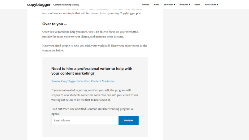
CopyBlogger designed an opt-in box with a detailed goal
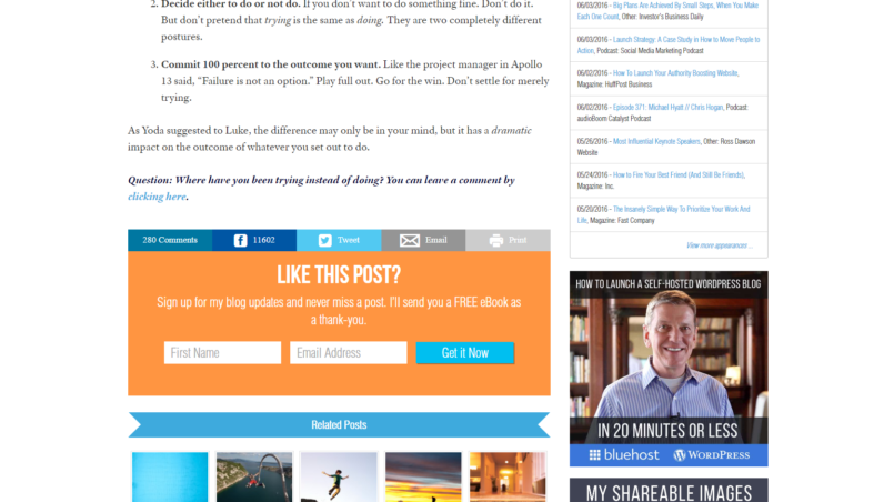
Michael Hyatt placed it at the end of his posts
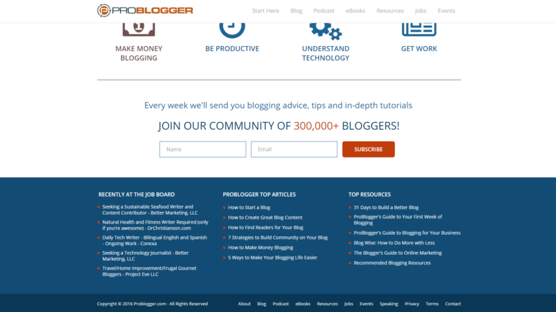
Problogger has it at the end of its Content
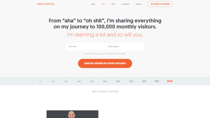
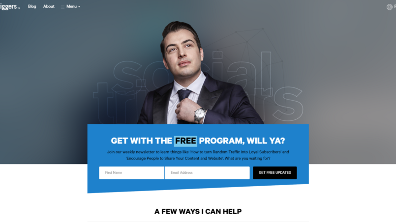
Featured Box on the Top
Famous Marketers and Bloggers are using this new trend to grow their email list drastically. Here are a few examples.
Neil Patel
Social Triggers
The Footer
Having a subscription form in the footer is traditional. So, If your visitor is in a hurry to sign up for newsletters, he will scroll down to the footer to find it. Meet their expectation and grow your email list 😉
Pop-up
Yes, Pop-ups. Although they are annoying as hell, they turn out to be the most effective way of turning visitors into subscribers. You don’t to throw pop-ups on people’s face. You can put it in a subtle way.
- Use a delay – Let the visitor stay on your website for few seconds before you show your pop-up
- percentage read – You can show your pop-up once the visitor is half way through the content.
- On exit– You can show your pop-up when the visitor is about to leave your website.
- Content lock as mentioned above can also serve as a decent pop-up.
Step 3: Create a Bait
No one gives you their email address unless they see value in it. Bait is exactly for that purpose. Once you have the collector in place. Develop different types of baits that suit your market persona the best. Here are few popular choice of baits.
Training videos
This could be a tool demo video or a discussion video which makes life easier for your potential customers
PDF files
This could be a collection of various links, transcribe of your Training Video or an interactive infographic.
Reports
This could be industry research or audience interaction metrics to a particular element. It could be an analysis of anything that could provide value.
excel sheets
Excel sheets have been a popular choice for ages. It could be a list of references, a formula to simplify data, easy way to project data etc.
Online tools
Could be a website analyser to find broken links or bugs or scoring data uniqueness, spam analyser
Step 4: Attack Strategy
Having an Email collector and Bait will turn your website visitors to your subscribers but there are few more tricks that could bring in a bulk of subscribers. To grow the email list we should be able to attack with different techniques. I have listed a few of those here.
Webinars
Organize Webinars with guests or do a topic with insights. Convert them into subscribers on Signups.
Email newsletters
Add your Social Media share buttons, Share to a friend and Subscribe button to spread your existing newsletter to their friends and family and turn them into subscribers using those button on the newsletter.
Social Media
- Facebook
- Organize contests and promote offers on the timeline. Give away free download which could be accessed upon email submission
- Twitter
- Promote an ebook or an infographic to divert the traffic to the website.
- Pinterest
- Create eye catchy cover and upload them on Pinterest with Links to download from the website.
- Youtube
- Create video and embed annotation with links to free downloads. Also, use the description to provide information or instructions.
- Instagram
- Similar to Pinterest use the same strategy here too. Good pics and links.
Online Partners
Find a partner, who could compliment your offerings and cross-promote your events. Swap your leads when desired for mutual benefits.
Guest Blogging
Offer your guest blogging content for an exchange of backlink and also info on the author at the end of the page with custom links to drive traffic to your website.
Organize events/meetups
You can gather people offline to discuss various topics over a cup of coffee or at a hangout place but make sure you RSVP them via email to convert them into subscribers.
Step 5: Unusual but brilliant
You might have spent days to create a beautiful content.
There is still a lot more in-depth content you could provide on the topic but you choose not to do it. Fearing it might make the post complex to understand.
Good news is that you could offer these insights as “Content Upgrade” in exchange for their subscription.
New visitors who found your blog link from external sources might find it interesting and this will boost your subscription rates further.
Brain Dean of Backlinko used the same strategy to boost his conversion rate to a whopping 785% in One day and that is Crazy!!

Step 6: Close those holes immediately
You have done everything that needs to be done to bring in more subscribers. But the results are not really what you expected. If you find yourself in such situation. One or more of the following might be the reasons.
Page load time
The average wait period of high churning websites is around 3-5 seconds. If you website is taking more than that to load. Call in your web developer and fix the load time. Viperchill shows you some interesting stats on Page load time impacting the business.
Cluttered website
Remember Yahoo search engine? Do you remember the last time you visited it?
One of the several reason why people love Google rather Yahoo is due to its clean, no clutter home page. So, if you want your visitors to stay for a longer period, It would be better if you could clear the unnecessary clutter images and widgets on the sidebar.
Typography
Typography makes a difference. Here are a few things you need to keep in mind to provide your readers with pleasant reading experience.
- Don’t use more than 3-4 fonts styles and weights on your web page.
- Don’t change the font in mid sentence unless you have a very good reason. It will cause a disconnect.
- Choose fonts from Sans-serif family. Serif is for print purposes.
Color palette
Stick to cool colors only. Your readers need to stay on your page for a long time so give them a pleasing appeal. Use warm colors only on pop-ups or announcements. Hire a web designer to design your brand image.
If you need further info on any topic discussed above, drop me a message and get back to you. If the choice is popular, I might do an extensive blog post on it.
So, Do you have any favourites ways to increase your subscribers?
Comment below and let us know.

