
Landing Page is a Thing of Beauty.
It gives us total control on the customer journey, if done right!
Helps us control – What we want to say and What we want our customers to hear.
If you are Launching a New Product or Testing out a New Idea or even trying to Generate more Leads, Landing pages is a killer tool that gives us Instant Marketing ROI when combined with PPC campaigns.
Keeping that aside, we can all agree that creating landing pages take a total different approach than creating a website.
I would consider website to be a brochure of your offerings while landing page is a direct demo on a single feature.
The better I convey what it does, better are my chances of selling that specific feature.
This means, Landing pages need to be Laser Targeted towards a Niche Audience.
We cannot achieve this in a single go. This takes:
- Insane amount of Research
- Competitors study
- Identifying your Ideal Customer
- Conveying the value of your Offering
All these elements need to flow through your landing pages into your customers mind and that is Art!
The elements mentioned above are not something I made up but critical aspects discussed and proven by MECLABS, Copybloggers, Instapage and many more..
How to Unlock this Secret Sauce
Assuming the visitors are coming from the PPC campaign, we know why they are here and unless we address the problem statement or the solution in the first fold of your Landing page, they are going to disappear in less than 3 seconds.
9 out of 10 visitors bounce from the average landing page. – Instapage
You need to let your customers know:
- What do you offer
- How did you help your clients in the past
- Why should they trust you
- What are the contingencies you offer
- How to reach you
- How to get started
If you address the elephant in the room and rush your prospect directly to the offerings or a call for action, all you would be doing is increasing their anxiety and panic; leading to clicking that “X” button on the top of your browser.
So, lets break this into two parts.
Part 1: Speak about the problem
Part 2: Why US
Part 1: Speak about the problem
No one wants to see your ad or hear you boast about something they don’t care.
They have a problem and they are looking for the right solution. PERIOD.
So, let your prospects know that you know what they are going through and you are going to help them.
Here are a few good examples on how a good landing page should start.
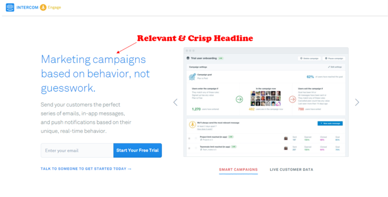
Intercom created a beautiful landing page with the first fold containing a powerful and relevant heading addressing the issue at hand. Supported by a sub text which gives a brief overview of how you can benefit. We are also provided by a side image showcasing the product preview.
I like the way they have done this although I wish things were a little brighter.
Since this is a product offering, I wouldn’t jump directly into providing my details so that the customer rep can call me day and night and push me into buying the subscription.
This might help if it was a service offering. Since every client has a different requirement, I would prefer to talk to a real person and understand their story.
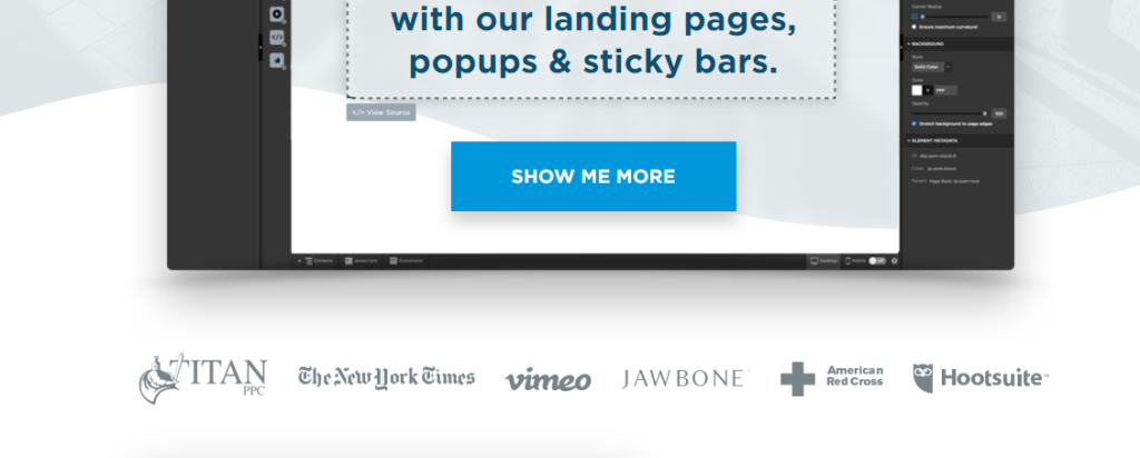
Now, lets look into an other example by OptimizePress landing page builder.
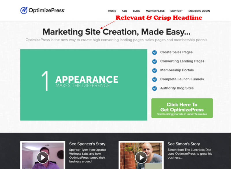
OptimizePress has done a wonderful job, by doing 2 things right.
- Got a strong main heading followed by an elaborate video. The video was too long thought, 3-4 mins might be a decent length. Probably an a/b test will help us decide better.
- If you carefully observe the moment you think, isn’t it a bit overwhelming to take in. They provide us with strong video testimonials.
Bravo! That got my “panic” state of mind back into “rest-assured” state of mind.
Even thought they had a lot to say to showcase they balanced the customer state of mind by reassuring and providing proofs.
At this point, I might be inclined to try that big green click-to-action button which is a win for OptimizePress as they succeeded in making me take the first steps towards the buying journey.
Lets look at one more landing page designed by Unbounce.
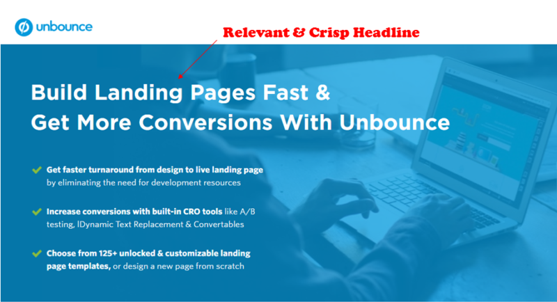
What I absolutely love about this landing page is “no-noise”.
- They are clear and concise.
- They have a clear Title heading and 3 bullet points to showcase their USPs.
This approach has an advantage. They are not forcing me into taking any action at the moment, which will trigger an ease and makes me scroll further down to see what else do they have to say and show.
If you carefully observe all three examples begin with a problem statement. The reason for this can be traced back to the ad you are running.
You need to take the initial step by letting your customers see exactly what they saw in the ad and nothing else. It could be a paid search ad or a paid video ad. No matter which ad it is, the customer would have related to it and clicked on it for him/her to reach your landing page.
So we have established that they are looking for what you got to offer. Now, you have a prospect who is interested to hear what you can offer, this is where Part 2 starts.
Part 2: Why US
Part 2 can begin with letting your prospect know – What are your offerings.
What do you offer
Use these examples to draw a familiarity on the various ways you can do this.
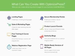
OptimizePress list out the areas you could use their product
While Intercom focuses on the in-app features they are offering
You vs. Competitors
Now, tell them why should they choose you over your competitors
Here is an example of how unbounce does it. Before they placed the call for action button, they are letting you know that they know, what you are going through and they have 14,000+ customers to vouch for their expertise.

Similarly, with Smartlook along with the strength in the client numbers they are also letting you know the size of the brands they are dealing. This gives you an understanding that their platform can handle the problem at such huge scales. Below the call for action they have placed the “you could have seen us in..” to inform you that we are well know in the market.

Now, tell them why can they trust you.
Show clientele
Unbounce list the kind of clients they have served in the first fold on the landing page to make sure, they are not a newbie in the industry
Similarly with Crazyegg but they have displayed them at the end of the landing page. Ideally both of them have placed them right above their call for action sections.

Show guarantees
If you are a consultant and not super famous in the industry, but your services are superior to current industry offerings, you should definitely pay attention to this section.
This will reduce customer’s hesitation to go with a newbie in the market.

OptimizePress offers –
- 30 days Money Back Guarantee – refund policy
- Ensure the payment gateways are secure
- Accepts Mastercard and Visa transactions

Intercom offers –
- Free 14 days Trial
- Option to cancel the subscription at any given time
Show proofs
Most effective ways to provide proof of you services, is to provide testimonials.
Now ask them to contact you
You need to provide a pleasing call for action button with the right assurances next to it like how OptimizePress did in the above examples.
If you are looking for more options, Brittany Leaning from Hubspot did a good job showcasing various examples of call for action buttons on this Link
You could pick one that suits your page color schema.
Tell them what happens when they contact you
Now that the customer have successfully reached out to you, It is your responsibility to guide them through the next steps and it starts from the thank you message of the form submission.
Below shown is the contact form response of Interworks. They let their customer/prospects know that one of their reps will call them to discuss further on their problem statement.

That is it… you have your Landing page!
Do you think the story is over? Nope!! definitely not!
But, this is where most people stop. The truth is that this is where it actually starts.
The one you just developed using the above elements could be called as a first draft of your landing page.
If you believe that this would be last, you are practically missing out on the opportunity.
Refine it further
Now that you have a copy to work with, you need supporting data to take the right calls to make right modifications.
You can get started with Google Analytics and Heatmap tools (based on your preference). Place the tracking code in the source code and let the campaign run with your initial copy. This will gather information on the customer journey including the conversion tracking. You can review them and back trace to the root areas they drove them to complete the goal.
Based on that you can make a second revision of the landing page. Even if everything is going great, you know that this is not 100%
There is money left on the table… You will be surprised how much you are leaving on the table and the only way to uncover it is to rinse and repeat the process.
All the best!
Tips:
To get started with this whole process you might be in the dilemma of whether to go with a Web Designer or Web Tool.
Each has its pros and cons but I would go with online tool as it lets me deploy iterations faster. I have explained the pros and cons and how to choose in this article.